
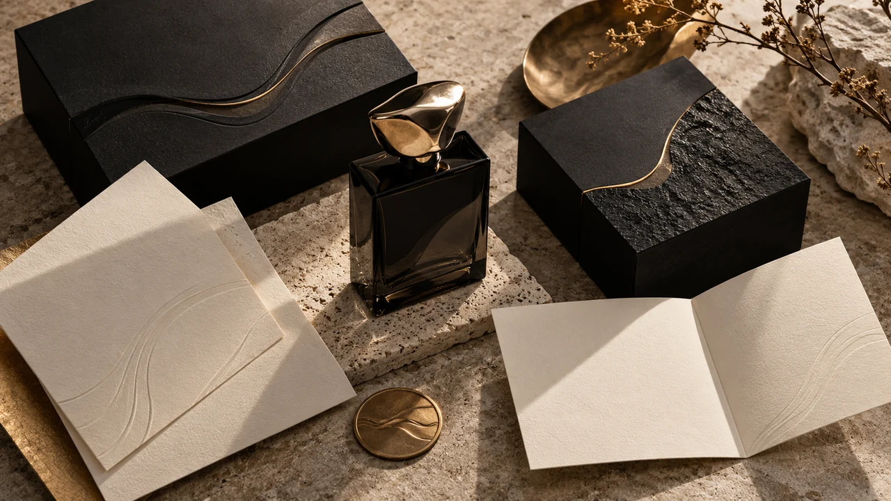
A black background and a gold wordmark do not automatically make a brand feel considered. Luxury presentation depends on relationships: how thick paper catches the light, how a small mark sits within generous margins, and how glass, metal and cloth respond differently. Begin with the business and the intended use, then describe those decisions in a brief the image model can interpret.
Give each direction a clear purpose
Graphics & branding offers identity direction, business-card, social campaign, packaging, website and landing-page image concepts. Choose the output you need to discuss. An identity study explores a visual language; a business card needs front/back hierarchy; a campaign needs a dominant message and useful copy space.
Describe the brand, audience and offer before specifying decoration. A quiet architecture practice and a bold fragrance launch may both seek a refined image, but their composition and material language need different decisions. Paste only the customer copy that should actually appear.
- 01Purpose
Identity, card, campaign, packaging or web visual concept.
- 02Craft
Specify stock, embossing, foil and the light revealing them.
- 03Hierarchy
Keep customer copy and palette above stylistic defaults.
Select a believable craft treatment
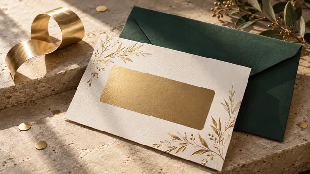
The builder separates surface treatment, print-effect study, studio lighting, camera and layout. Cotton paper and book cloth can suggest tactile restraint. Fine letterpress or blind emboss needs raking light to show an impression. Heavy glass benefits from controlled reflections and optical depth. Selective foil should occupy a deliberate detail rather than cover every surface.
Each direction already carries detailed craft instructions. Change a control when you have a reason, or preserve source materials and lighting when working with an established identity. These choices describe how the image should look; paper thickness and emboss effects in a generated concept are not manufacturing specifications.
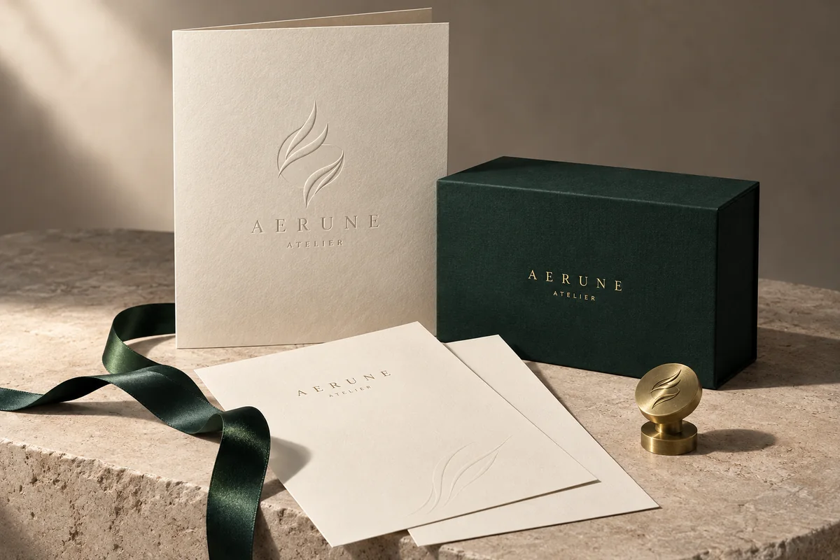 Identity
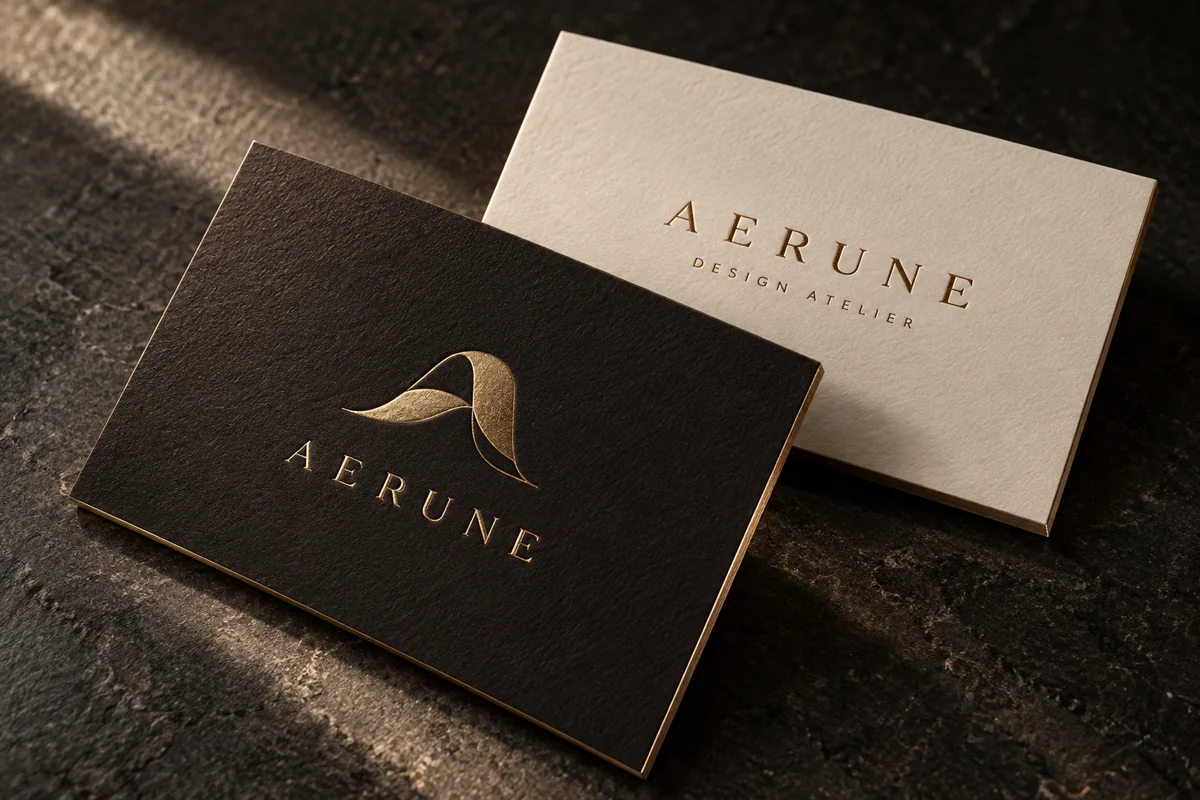 Business card
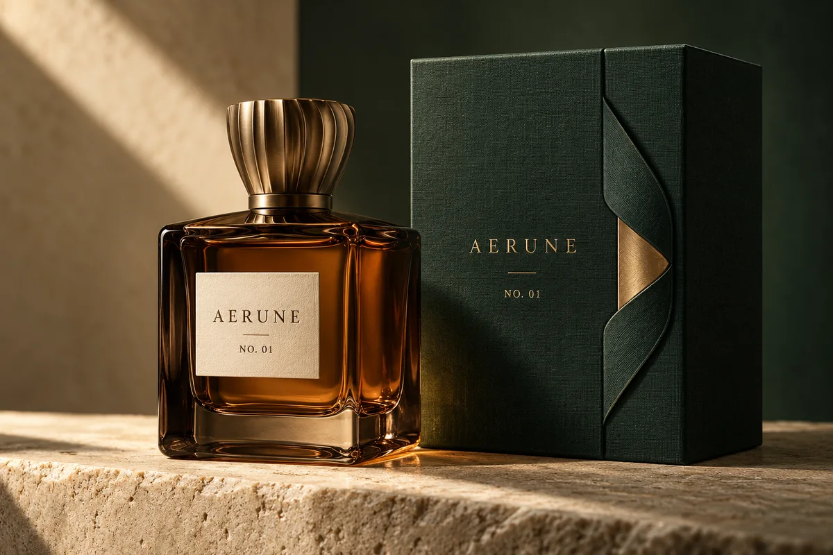 Packaging
Review the image and the final prompt
The sample viewer shows the actual prompt used to generate that fictional example. Viewing it does not replace your brief. Review your own compiled prompt, confirm the draft handoff, then check Studio settings and the quote before starting generation.
Inspect every letter, small mark, reflection and material boundary in the result. Correct typesetting and prepare production artwork in the appropriate design tools. The output remains a raster concept: exact brand fidelity is not guaranteed, and the website directions produce static images rather than working pages.


A space for thoughtful feedback.
Questions, useful details and new ideas are all welcome.
Reader reviews
No published reviews yet. Your perspective could be the first.