
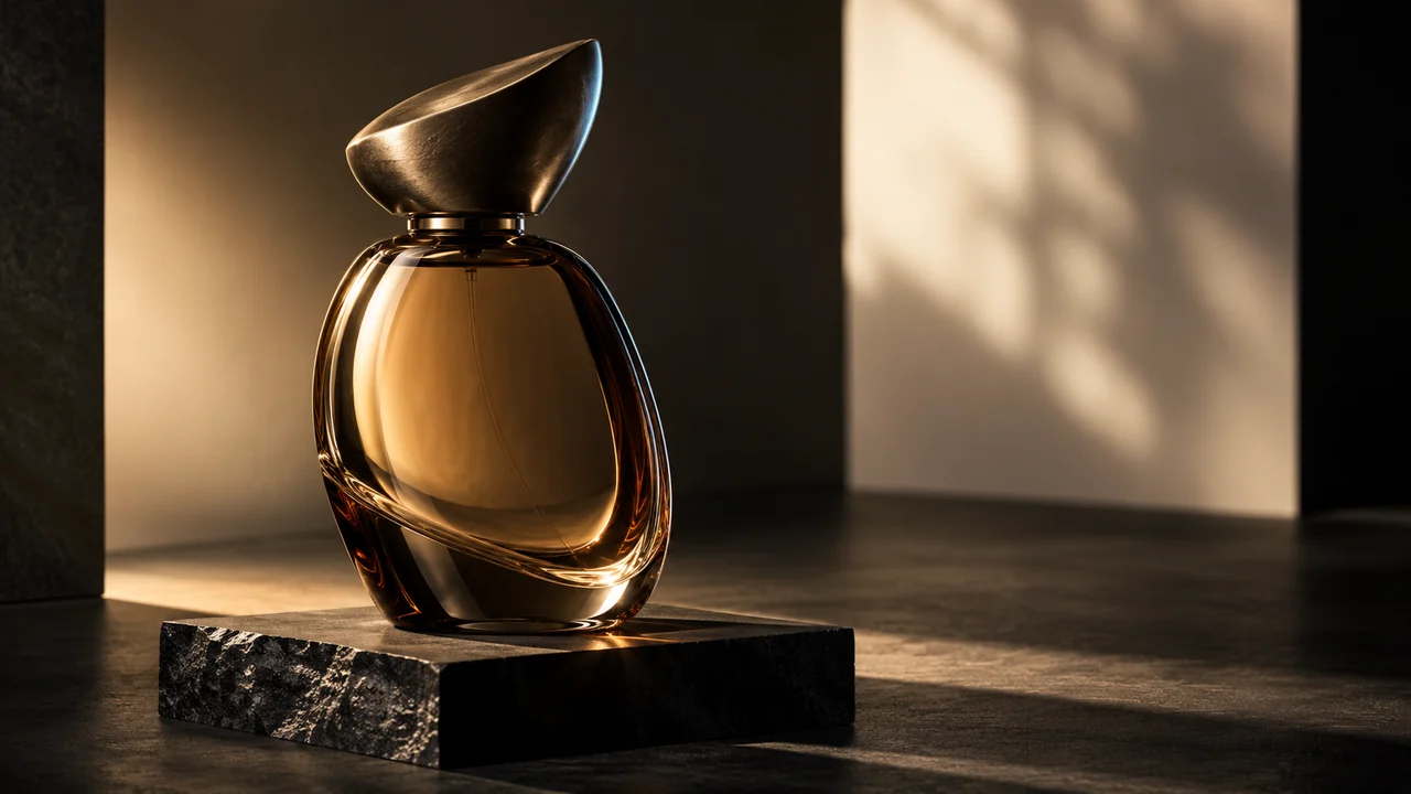
A convincing product image makes different materials behave differently. A cotton label should not shine like its glass bottle, and brushed metal should not look like polished plastic. Useful lighting instructions explain what needs to become readable: the bottle’s thickness, the paper’s fibres, a clean carton edge or the curve of a small metal cap.
Preserve identity before adding atmosphere
Start by naming what must stay: silhouette, proportions, cap construction, seams, controls, label artwork and the actual number of packaging units. If the source is an existing product, a beautiful result that changes those details may be unsuitable for the brief.
Separate material refinement from material replacement. Preserving source materials means improving their visible response, not turning a matte carton into metal. When a concept permits new finishes, state the allowed surfaces and keep the customer palette and copy authoritative.
- 01Key light
A large diffused source defines the main form.
- 02Edge & flags
A controlled rim and dark reflections separate glass and metal.
- 03Grounding
Contact shadows and believable scale keep the object present.
Choose light for the surface
A large diffused key creates broad, controlled reflections and a gentle fall-off. Raking light can reveal paper grain and a subtle impression. A sculpted key with a narrow strip rim can separate glass or metal from a dark backdrop. Cinematic editorial light is useful when one hero product needs more atmosphere, provided the silhouette and copy remain readable.
Ask for open shadows, controlled highlights and a grounded contact shadow. These are more useful instructions than excessive glow or maximum gloss. Do not add caustics simply because the sample contains glass; they should relate to the material and light actually present.
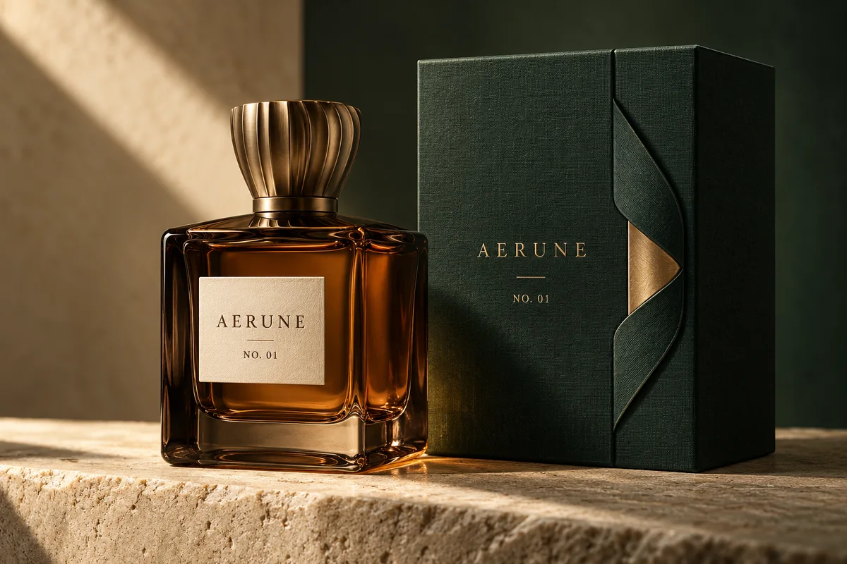 Glass & metal
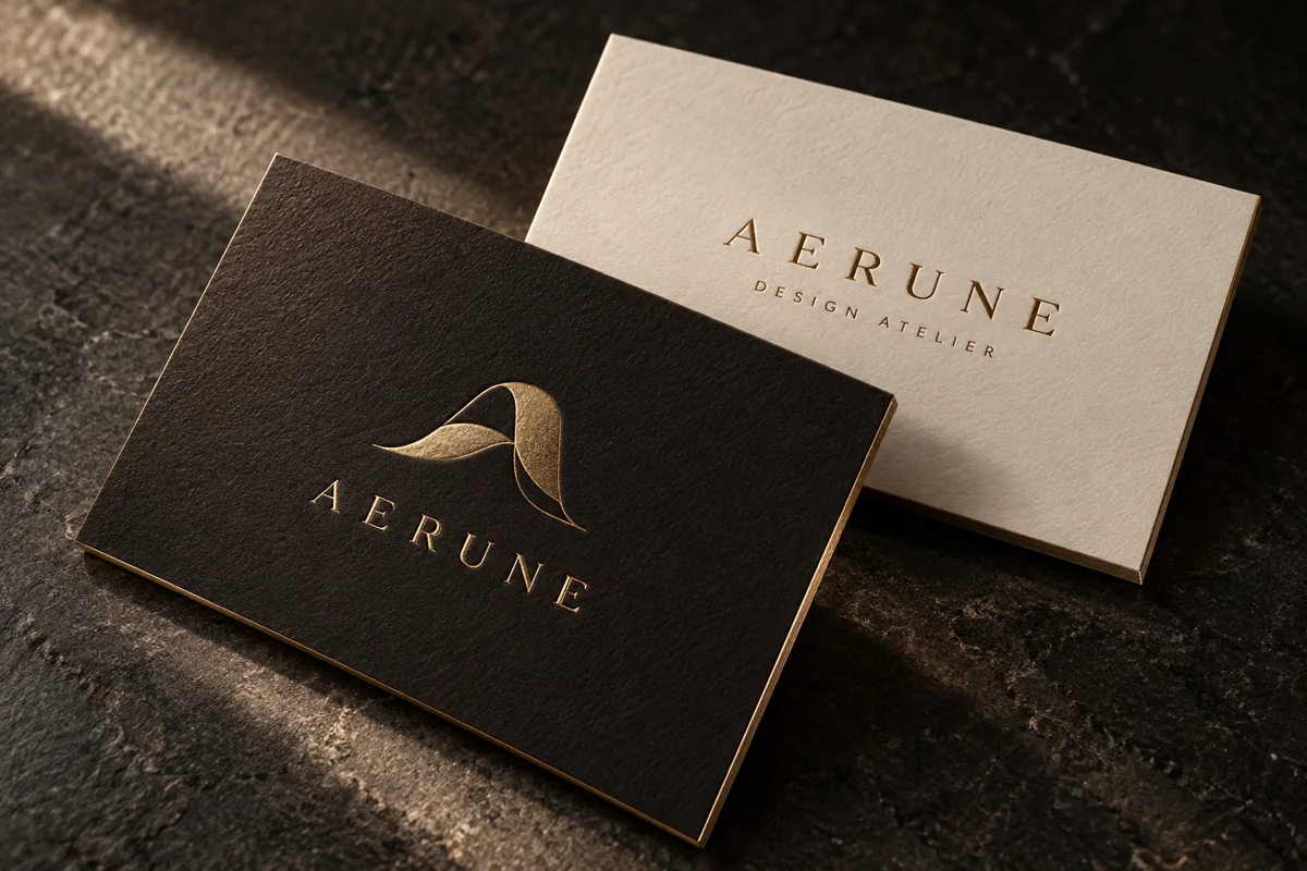 Paper & foil
Connect the material, camera and background
The graphics builder includes cotton paper/book cloth, heavy glass/machined metal, leather/fine hardware and digital editorial treatments. Pair them with a sensible camera choice. A three-quarter still life explains form; a macro view explains a permitted finish detail. Keep required label text visible and avoid perspective that stretches the product.
Choose a restrained backdrop that separates the product: pale stone for dark glass, or a darker surface for an ivory label. Follow your palette and composition rather than imposing a luxury colour scheme.
Refine this supplied bottle and carton without changing shape, unit count, label artwork or copy. Resolve glass thickness, matte paper fibres and the existing brushed cap. Use a large diffused side key with a restrained strip rim, open shadows and controlled highlights. Preserve the camera and palette; add no props or text.
Inspect the boundaries and small details
Review label edges, cap seams, glass reflections, paper grain scale and contact shadows at a useful viewing size. Check every letter separately from the overall atmosphere. The Product packaging sample is an independently generated concept, not proof that another source will transform into the same design.
Apply the reviewed brief to the Studio draft and check settings and price before generation. Treat the result as a visual study; exact text, production finishes and manufacturing tolerances require their own checks.


A space for thoughtful feedback.
Questions, useful details and new ideas are all welcome.
Reader reviews
No published reviews yet. Your perspective could be the first.